DESIGNER ∘ DIRECTOR
2021
Studio: We Are Royale
Role: Art Directior
Executive Creative Director: Loren Judah
Producer: Trevor Steadman
Lead Designer: Daniel Beaton
Lead Animators: Dylan Casano & Jarred Norby
Case study taken from We Are Royale

NEXT LEVEL
COMPETITION
Major music artists throw concerts within the game and movie studios hold watch parties for entire films. There’s truly no limit to where Fortnite will go next. So when the esteemed competitive team at Epic Games hit us up to help them re-design their broadcast kit, we were caught speechless at the opportunity. Together, we set out to create something entirely new for the franchise with a broadcast kit that not only pushed the envelope of broadcast design but also enabled them to evolve the look right alongside the game and the players.
Fortnite has taken the world by storm since its initial release in 2017. Not only is it one of the most popular battle royale games ever played, but it’s also constantly reinventing itself every year as it seeks to define its own narrative in the future of interactive entertainment. In Fortnite a player can explore a vast open world, pilot helicopters, join a team fighting for supremacy, or just go fishing. On top of the game, the platform has become a hub for a whole new genre of interactive entertainment. On top of the game, the platform has become a hub for a whole new genre of interactive entertainment.
DESIGN
EVOLUTION
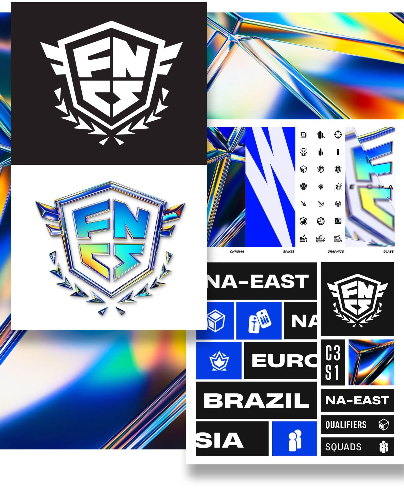
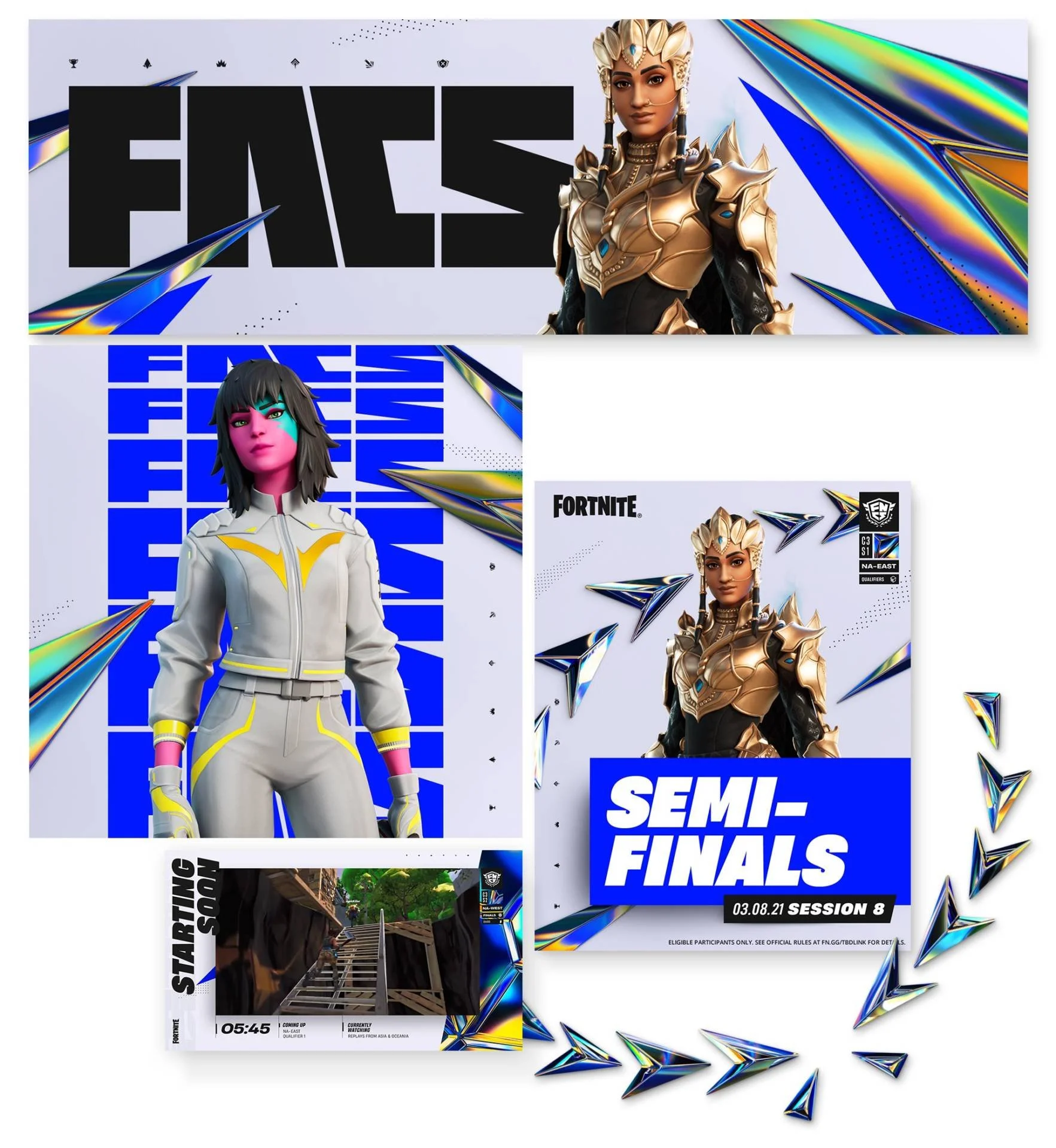
The visual style of the Fortnite Competitive (FNCS) toolkit included layers of design that brought the game’s aesthetic into a new era. Graphic spikes were complemented with graphic flourishes and icons. Typography became textural and informational as it was used throughout every aspect. We designed a new logo for FNCS, then amped it up by making it chrome. We also brought a whole kit of Fortnite elements into this chrome language that became a burst of color in quintessential Fortnite fashion.
To top it off, we brought in a fractured glass layer that would be used to illustrate the progression of a season. As the season went along, the glass would become less foggy and refractive. Eventually, all of these elements came together to create a unique style fit for the Fortnite brand.

TAG IT!
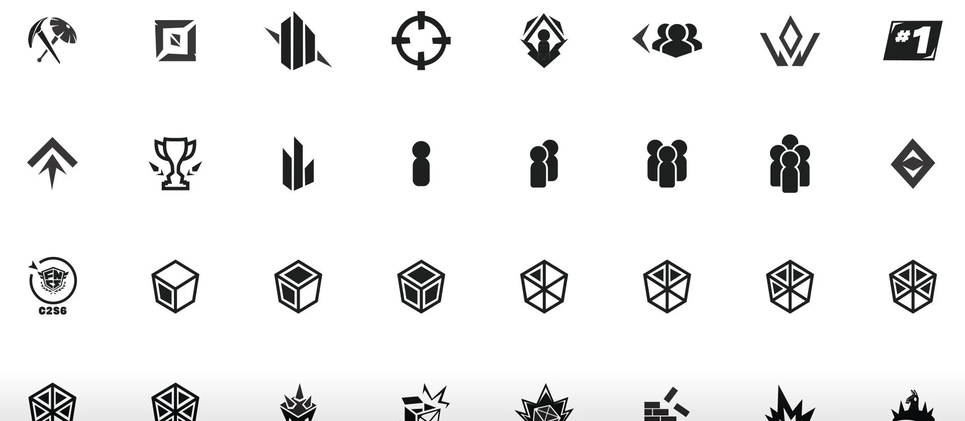
A graphical Tag system was created for the kit that became a persistent design element in the corner of the broadcast frame. This small design element houses a multitude of information that can give viewers a quick read on what they’re watching in all markets around the world. Fortnite has a whole slew of competition formats and regions of broadcast, so this tag system became indispensable as the kit was being finalized.

LIQUID CHROMA
The customization is endless with so many elements of design being set up to change and opens new doors to future interactivity from the broadcast team and players.
With the design language layering on a whole smash of Fortnite aspects we wanted to bring in elements of customization that would allow the team at Epic to update and tweak the kit as they saw fit. Beyond color, we also developed a design language that would enable us to update the chroma elements with new color kits for future seasons and special events.

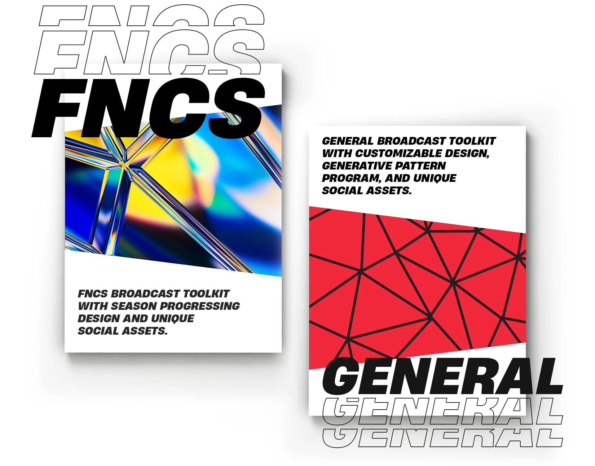
TOOLKIT PART DEUX
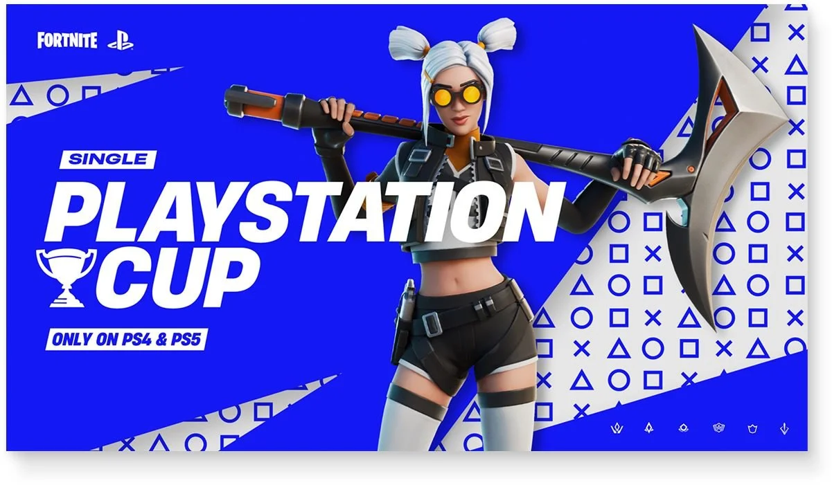
In addition to FNCS, we also created a separate toolkit for all events and tournaments that were not part of the FNCS season. These events are hosted games all around the world by teams, sponsors, and groups. We brought similar design motifs to play in this toolkit but wanted to approach the customization in a whole new way
We knew that anyone taking on their own event would want their kit to be custom-tailored to themselves as much as possible. With this kit we found a balance between the Fortnite design language and customizable options that let broadcast teams change many unique elements.


PATTERNS
Without the chroma aesthetic of FNCS, this kit needed its own customizable element. Here we created a generative pattern system that was rooted in the Fortnite language but could be generated for each and every event with unlimited design potential. In addition, we created our own app to be delivered to the team at Epic that let them create their own tileable patterns that could then be brought into the kit and used as part of the design. These patterns could also be used outside of broadcast in marketing, print, and any kind of swag in need of that textured pattern. The patterns are the signature for each event and the pattern generator app gives full control to the teams in need of making their event look unique.


CUSTOMIZE IT ALL
The General Partner kit was created to allow for as much customization as possible. Not only do broadcast teams have control of the colors and textures, but they can bring in their own graphics for use right along with their own custom set typography. With just a few tweaks, new kits can be created that really stand out from the rest giving broadcasters unique opportunities while staying firmly within the Fortnite Competitive world.

LEVEL UP
As these new features start to come online these broadcast kits will evolve to let fans become part of the experience and even be able to change it in real time. Welcome to the future of interactive broadcast design.
With competitive gaming truly becoming a household activity, we’re looking at the advent of broadcast design kits that need to communicate a whole new level of sensibilities for an audience that demands so much more. This is the beginning of an evolution in broadcast design as we continue to explore interactive elements between the game and the fans watching.
